
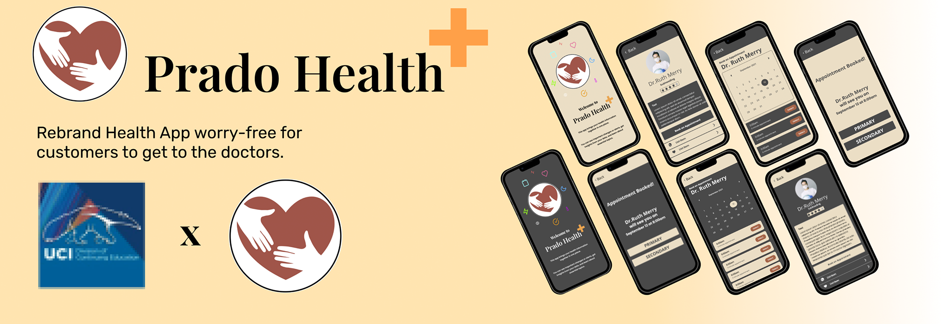
Project:
Rebrand Health App that is worry-free for customers to get to the right doctors.
The Challenge:
Prado Health mission is a mobile app designed to help customers search for doctors within their area and book appointments.
The Solution:
Conducted user research to gather insights and identify pain points.
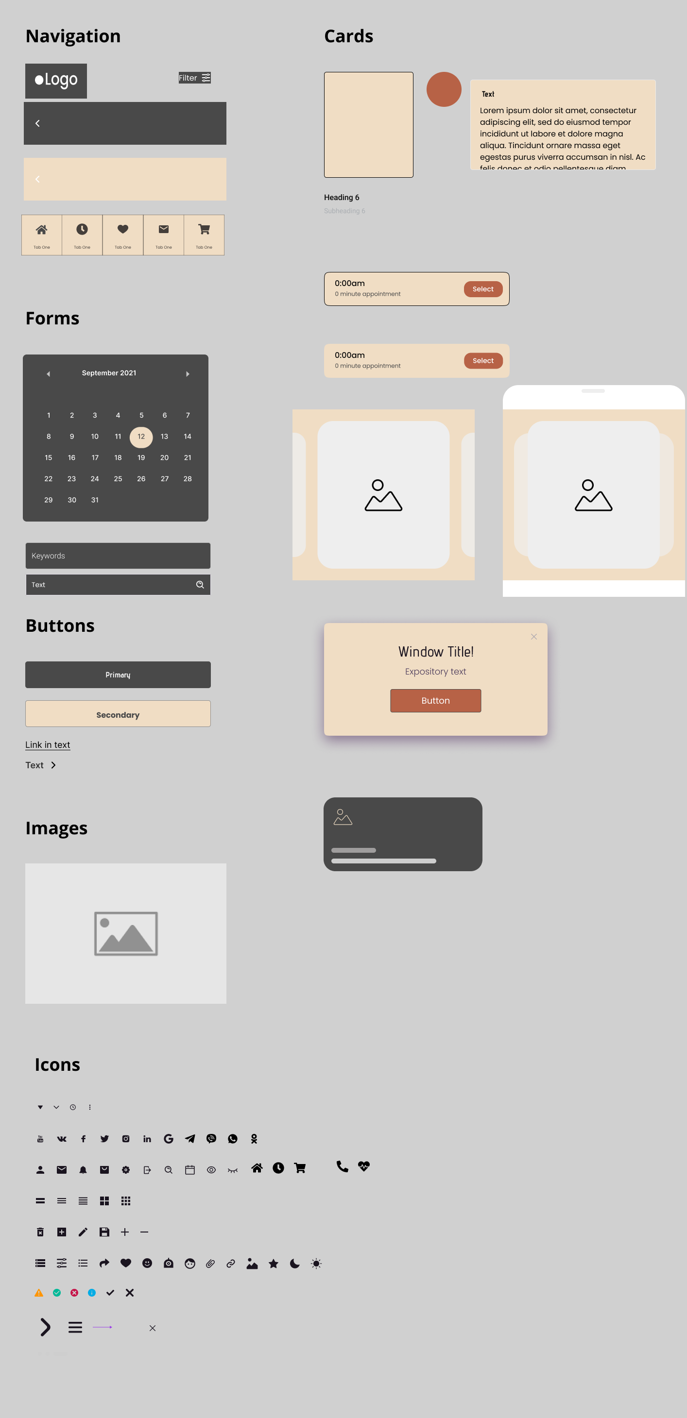
Created wireframes and prototypes to test and refine the design.
Designed and developed the new website using HTML, CSS, and JavaScript.
Implemented responsive design to ensure the website was optimized for mobile devices.
Conducted usability testing to gather feedback and make any necessary adjustments.
Tools:
• Figma
• Google Docs
• Zoom
• Miro
Design Process:
•Competitive Analysis
•Heuristic Evaluation
•Personas
•Discover & Research
Role:
Project Roles: UX Research and UI Design (Team of 1)
Duration:
1 Weeks
Prado Health Mission Statement:
“At Prado, we believe that good health is a fundamental right for every person, and our mission is to enable easy access to quality healthcare for every member of our community.”
Strategy
Creating a Mood-board:
I began by gathering inspiration from serene environments in nature to create a mood-board, thinking about the positive impact this could have on patients who would regularly use the app. But also the word "Prado" in Spanish means meadow, pasture, and prairie which fits the feel of what I'm imagining.

Building a Style Guide:

To determine my color palette, I started sampling colors from nature itself. I was able to find a theme that are common colors found in various landscapes. I knew what colors I wanted since the beginning of this project, warm and fixed colors such as off white and Arizona Desert Mood in order to make our customers feel more relax.
In the process of navigating through Prado Health Application, it can be stressful sometimes. I have chosen these 2 fonts because I wanted the users to have easy to read fonts. With so much information in regards to health and wellness, it sometimes can be overwhelming for one to read all the text words.
Kick-Off Meeting:
I started off this project by reviewing the brief and taking notes of what the application was capable of. I met up with my team with on miro to discuss the entire inventory list of the website. We took the time to become familiar with the unemployment website and understand the vision of it.
During this meeting, we listed as much solutions on how challenging it would be for a Pet to connect with a Veterinarians.
• The app should be easy to navigate and understand, with clear and simple instructions and prompts.
• The app should have a secure login system to protect personal health information and encryption to protect data during storage and transmission.
• The app should have a personalized dashboard that shows users relevant information such as upcoming appointments, medications, and test results.
• The app should have analytics capabilities to measure the effectiveness of the app and to identify areas for improvement.
Research
As part of the redesign of the Prado Health Application, I conducted user research to gather insights and identify pain points. The research methods used included online surveys, interviews, and usability testing.
Remote patient monitoring: Use wearable technology and telemedicine to remotely monitor patients with chronic conditions and alert healthcare providers to potential issues.
Mental health support: Develop tools to support mental health, such as virtual therapy sessions, mood tracking, and resources for coping with stress and anxiety.
Medication management: Develop tools to help users manage their medication schedule, track side effects, and interact with their healthcare providers.
Social support: Create a platform for users to connect with others who have similar health conditions and share information and support.
Health education: Provide educational resources on various health topics such as disease prevention, healthy living, and health-related news.
Gamification: Incorporate game elements like points, rewards, and leaderboards to motivate users to engage in healthy behaviors.
Based on these findings, the team was able to redesign the application to address these issues and create a more user-friendly and accessible experience for Pet Owners and Veterinarians.
Our Users:
After conducting UX research by interviewing and surveying users, we were able to better understand their pain points, needs and expectations when searching for a Health Care App.
“Looks warm and inviting. It looks easy to navigate and the Dr. looks friendly.”
-User Feedback
“Professional, user friendly tool, and appealing.” -User Feedback
Solving Tracy's Problem:
Tracy was a busy working mom who always put her family and career first. She didn't have much time to think about her own health, but deep down she knew that something wasn't right. She had been experiencing fatigue, headaches, and a general feeling of un-wellness for months. She downloaded the app and completed a detailed health questionnaire. The app analyzed her answers and provided her with a personalized plan for improving her health. The plan included suggestions for diet and exercise, as well as resources for managing stress and anxiety. As time went by, Tracy's energy levels increased, her headaches disappeared, and she felt better overall. Thanks to the Prado Health App, she had finally regained control of her health. She was grateful to have found the Prado Health App, which had become her trusted companion on her journey to better health.
Prototyped Ideas:
With the help of our minds we started thinking about Prototype Ideas such as
Virtual Consolations where the app would allow users to consult with medical professionals via video conferencing and receive personalized treatment recommendations.
Health Tracking, where the the app allow users to track their vital signs, symptoms, and progress over time in order to monitor their health status.
Doctor Appointment scheduling where it allow users to schedule and manage their doctor appointments directly through the app.
A big idea I also had was having a community support that allow users to connect with others who have similar health conditions and share information and support through forums, chats or video calls.
User Journey:
But before building a prototype to test with users, I had to created a user journey to find out and thoroughly map out Tracy’s actions, pain points, emotions, and interactions while navigating the app. This method allowed us to empathize once again with users to design a seamless experience that would exceed their expectations.
Wireframes in Figma

Low-Fidelity Wireframes - Booking an Appointment.
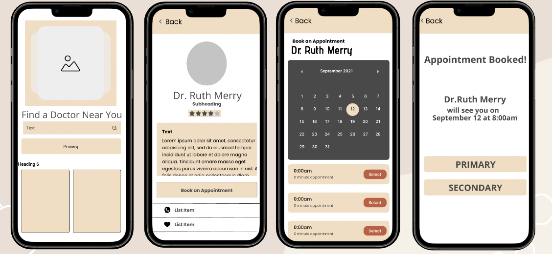
Mid-Fidelity Prototype - Booking an Appointment.
Usability Testing:
To optimize the user experience, I conducted a moderated remote usability test to find out if our prototype met their needs. We observed users’ amount of clicks taken to complete an action and documented their feelings as adjectives when completing the user flow. The testing can be conducted in person or remotely and can include tasks such as creating an account, scheduling appointments, and accessing health information. The feedback from the testing can be used to improve the app's user experience and make it more user-friendly for the patiences.
"The layout was confusing, I wasn't sure what to do next."
-User Feedback
"I wish I could select options instead of having to type all my information."
-User Feedback
Results:
Users shared they did not believe they would find the right vet based on the user flow they completed. So we took their feedback and iterated our prototype once again.

Final Iterations - Booking an Appointment.
Outcome:
We received positive feedback from users like Tracy showed that the Prado Health App was a valuable tool in helping them improve their health. Many users reported feeling better overall and experiencing a significant improvement in their symptoms, such as increased energy levels and reduced headaches. The app's community support feature also received positive feedback, as users found it helpful to connect with others who had similar health conditions and share information and support. The educational resources provided by the app were also found to be informative and helpful. Overall, the Prado Health App was seen as a comprehensive and user-friendly tool that helped users take control of their health and improve their well-being. Many users, like Tracy, shared their stories of how the app helped them get their health status back to normal, and they were grateful for the positive impact it had on their lives.