

Project:
Mississippi Department of Employment Services Website Redesign
The Challenge:
The Mississippi Department of Employment Services hired a team of designers and developers to redesign their website to improve the user experience and make it more accessible for job seekers and employers.
The Solution:
Conducted user research to gather insights and identify pain points with the current website
Created wireframes and prototypes to test and refine the design
Designed and developed the new website using HTML, CSS, and JavaScript
Implemented responsive design to ensure the website was optimized for mobile devices
Conducted usability testing to gather feedback and make any necessary adjustments
Tools:
• Figma
• Google Docs
• Zoom
• Miro
Design Process:
•Competitive Analysis
•Heuristic Evaluation
•Personas
•Discover & Research
Role:
Project Roles: UX Research and UI Design (Team of 4)
Duration:
5 Weeks
Kick-Off Meeting:
I started off this project by reviewing the brief and taking notes of what the application was capable of. I met up with my team with on miro to discuss the entire inventory list of the website. We took the time to become familiar with the unemployment website and understand the vision of it.
During this meeting, we listed as much solutions on how challenging it would be for a Pet to connect with a Veterinarians.
• Limited availability of veterinarians in certain areas, particularly rural or remote locations.
• Financial constraints, as veterinary care can be expensive and may not be covered by insurance.
• Difficulty finding a veterinarian who is experienced in treating a specific type of pet or medical condition.
• Difficulty in transportation for larger animals.
Research
As part of the redesign of the Mississippi Department of Employment Services website, a team of designers and developers conducted user research to gather insights and identify pain points with the current website. The research methods used included online surveys, interviews, and usability testing.
The research revealed several key areas for improvement, including:
The website was difficult to navigate and lacked a clear structure
The search function was not effective and returned irrelevant results
The website was not mobile-friendly and did not display well on smaller screens
The information on the website was difficult to find and not organized in a logical manner
The website did not provide enough information on the services offered by the department
Based on these findings, the team was able to redesign the website to address these issues and create a more user-friendly and accessible experience for job seekers and employers.
Our Users:
After conducting UX research by interviewing and surveying users, we were able to better understand their pain points, needs and expectations when searching for a trustworthy and qualified vet.
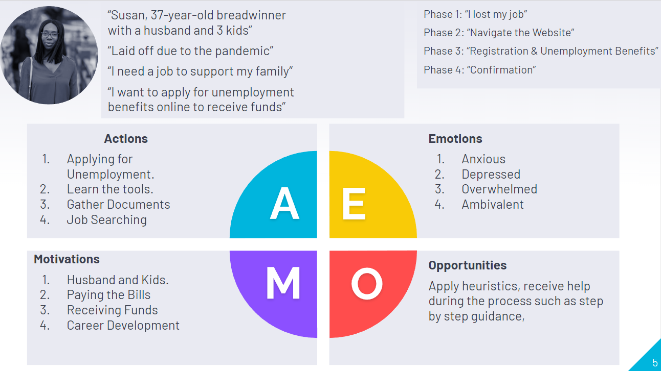
Solving Susan's Problem:
Susan was laid off due to the pandemic and began searching for a new job. She utilized various resources, such as online job search websites and networking with her professional connections, to find job openings that matched her skills and experience. She also reached out to the Mississippi Department of Employment Security (MDES) for assistance and they provided her with job search resources and training programs to help her improve her chances of finding a job.
Collaborating and Ideating with the Team:
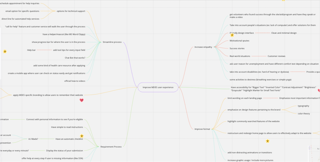
Collaborating remotely with a team of 4 UX Designers, we put our design thinking skills to work in order to find a solution for users like Susan. Using Miro helped us reveal user insights using methods like Affinity Mapping, Task Flows, and MoSCoW Matrix.
Prototyped Ideas:
With the help of our minds we started thinking about Prototype Ideas such as:
User-friendly interface: The website should have a simple and intuitive design that makes it easy for users to navigate and find the information they need.
Online application: Users should be able to submit their unemployment application online through the website. This would make the process more efficient and accessible for individuals without access to a physical office location.
Eligibility checker: The website could have a tool that allows users to quickly determine if they are eligible for unemployment benefits.
Document upload: Users should be able to upload necessary documents, such as proof of income and employment, directly to the website.
Claim status tracker: Users should be able to log into the website to check the status of their unemployment claim and receive updates on any necessary actions they need to take.
Live chat or virtual assistant: The website could provide a live chat or virtual assistant feature to help users answer any questions they have about the application process.
Building a Style Guide:
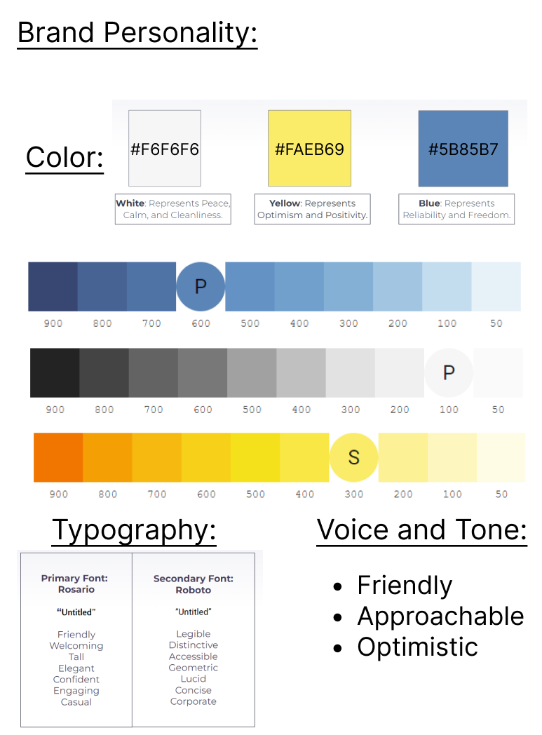
The style guide for this project outlines the use of three colors, #F6F6F6, #FAEB69, and #5B85B7, and two typography, Rosario and Roboto, to create a cohesive and consistent visual identity. The primary background color is #F6F6F6, which is light gray. The warm yellow color #FAEB69 will be used as an accent color to add visual interest and highlight important information. The cool blue color #5B85B7 is used as a secondary accent color to create a sense of calm and professionalism. Rosario will be used for headlines and other large text, to create a bold and attention-grabbing look, while Roboto will be used for body text and other smaller text, to create a clean and easy-to-read look. The voice and tone of the website is friendly, approachable, and optimistic, using a warm and welcoming tone, making users feel comfortable and at ease when navigating the site.
User Journey:
But before building a prototype to test with users, our team created a user journey to find out and thoroughly map out Susan’s actions, pain points, emotions, and interactions while navigating the app. This method allowed us to empathize once again with users to design a seamless experience that would exceed their expectations.
Wireframes in Figma
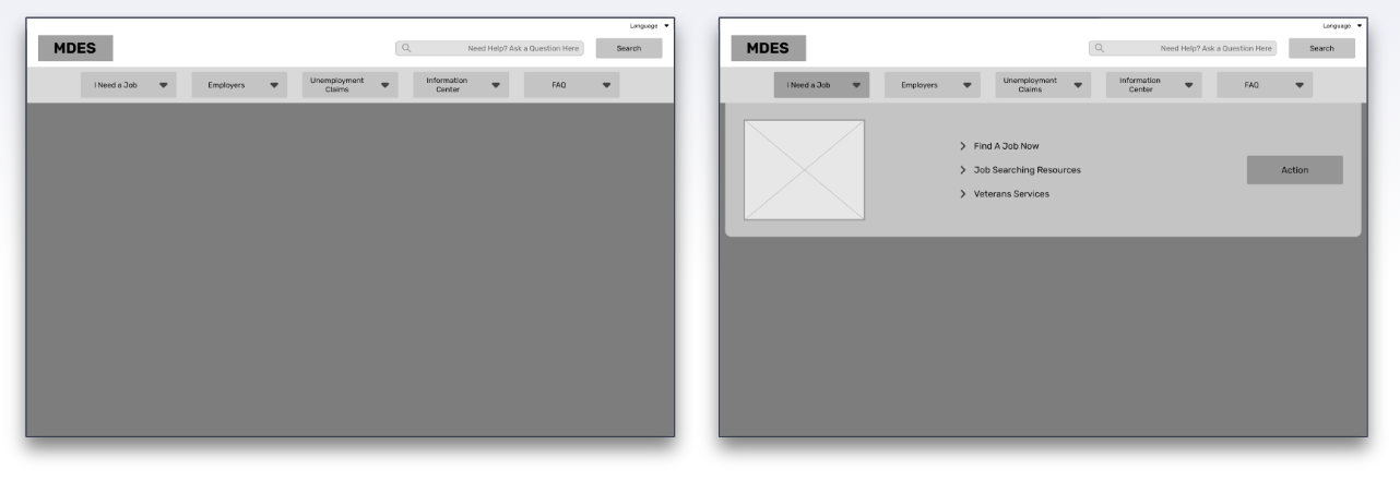
Low-Fidelity Wireframes - Creating a Profile.
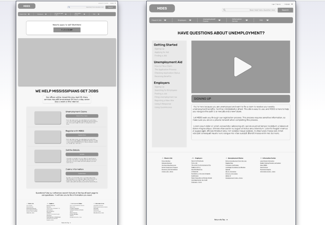
Mid-Fidelity Prototype - Creating a Profile.
Site mapping:
During our site mapping process, our team made an agreement that there were way too many options in the navigation bar. Our goal was to reduce the amount of categories as much as possible to reduce the confusion for the user.

Original Sitemap

Iterated Sitemap
Usability Testing:
To optimize the user experience, we conducted a moderated remote usability test to find out if our prototype met their needs. We observed users’ amount of clicks taken to complete an action and documented their feelings as adjectives when completing the user flow. The testing can be conducted in person or remotely and can include tasks such as creating an account, scheduling appointments, and accessing personal information. The feedback from the testing can be used to improve the app's user experience and make it more user-friendly for unemployment users.
A/B Testing:
A/B testing was performed on the help section of a website to determine the effectiveness of asking users how confident they are when they try to ask questions and have them answered and the visibility of the help section on the landing page. The goal of the test was to understand if asking users to rate their confidence level before submitting a question would lead to better engagement and more accurate responses. Two versions of the help section were tested: version A, which did not include a confidence rating, and version B, which included a confidence rating.
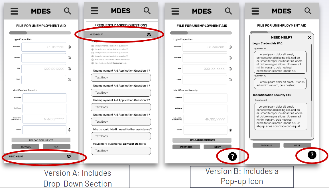

The results of the test showed that asking users to rate their confidence level before submitting a question led to a higher engagement rate. Users who were prompted to rate their confidence were more likely to submit a question, and the questions they submitted were more specific and detailed. Additionally, the responses to the questions were more accurate, as the team was able to better understand the context of the question and provide more relevant answers.
Overall, the A/B testing results indicate that asking users to rate their confidence level before submitting a question can lead to better engagement and more accurate responses in the help section of a website.

Final Iterations - Based on Users Feedback
Outcome:
The Mississippi Department of Employment Security (MDES) website received positive feedback from users who were able to access the resources and assistance provided by the agency. The website was designed with a user-friendly interface, which made it easy for users to navigate and find the information they needed. The online application feature also allowed users to submit their unemployment application online, making the process more efficient and accessible.
Users also found the eligibility checker tool helpful in determining if they were eligible for unemployment benefits. The document upload feature allowed users to easily upload necessary documents, such as proof of income and employment. The claim status tracker feature enabled users to check the status of their unemployment claim and receive updates on any necessary actions they needed to take.
Overall, the positive feedback from users indicates that the MDES website was able to effectively provide the resources and assistance needed for individuals who have been laid off or are otherwise unemployed to find new employment opportunities.